

 Illustrative stock photo (source: TASR)
Climatologist Ed Hawkins is showing how climate changes impact the temperatures in the countries across the globe in a very simple way. He turned the average temperatures into stripes, with blue ones being temperatures below average and red ones above it, the Sme daily reported on its website.
The increasing number of red stripes can also be seen in Slovakia.
“These ‘warming stripe’ graphics are visual representations of the change in temperature as measured in each country over the past 100+ years,” Hawkins wrote on the Show Your Stripes website. “Each stripe represents the temperature in that country averaged over a year. For most countries, the stripes start in the year 1901 and finish in 2018.”
Create your own visualisation
Every visitor to the website can create their own visualisation. All they need to do is select the region and the country, and then download the image if they want.
As the climatologist wrote, they are all free to use.
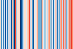

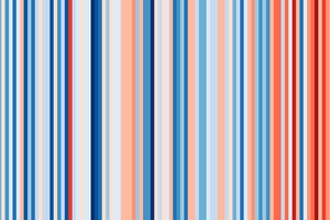
“These graphics are specifically designed to be as simple as possible, and to start conversations about our warming world and the risks of climate change,” Hawkins wrote. “There are numerous sources of information that provide more specific details about how temperatures have changed, so these graphics fill a gap and enable communication with minimal scientific knowledge required to understand their meaning.”
For most countries, the data comes from the Berkeley Earth temperature dataset, updated to the end of 2018, while for some countries (specifically the USA, the UK, Switzerland and Germany), the data comes from the relevant national meteorological agency.
