
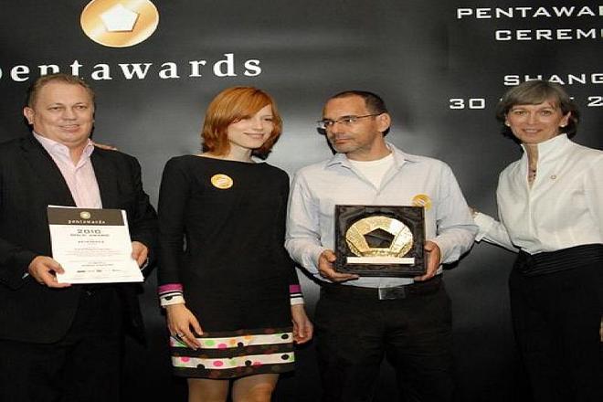
 Lívia Lörinczová (centre left) and Juraj Demovič (centre right) accept their Pentaward. (source: Courtesy of Pergamen)
IT IS a truism confirmed by the market: the success of a product depends greatly on how it is packaged and whether customers perceive it as attractive. After the grey years of communism, during which packaging was typically plain and uninteresting, Slovak designers can now create interesting and eye-catching designs. And collect awards for them. One of them is Pergamen, a small design studio from the western Slovak town of Trnava, which has garnered national as well as international awards for its design for a new bottle and logotype for Tatratea, a strong Slovak spirit. The design for the bottle, which resembles a traditional thermal flask, and its distinctive ‘T’ logo, created from elements of folk artwork, in May won Pergamen the Zlatý Klinec 2010 national creative advertising competition award in the category of packaging design; later in 2010 it also picked up a gold Pentaward and Reddot Design award.
The Slovak Spectator spoke to Juraj Demovič, one of designers and owners of Pergamen, about the work on the winning design as well as the process of creation in general.
The Slovak Spectator (TSS): Do you regularly enter your designs in competitions?
Juraj Demovič (JD): Relatively rarely. We did not enter many in the past and it was actually by agreement with the client that we entered this design in several contests. It turned out that we succeeded in almost all of them. Among the awards, we appreciate most the Pentaward and Reddot Design award because these are prestigious international contests where a lot of very good works meet.
TSS: Could you describe the process of creating the new bottle and logotype for Tatratea?
JD: Its producer, Karloff, a distillery from eastern Slovakia, addressed our design studio first with a small assignment to facelift the label of its leading product, Tatranský čaj, a strong tea-based liquor with herbs. At that time the idea was only to update the label, which was already known and recognised among buyers. Right at the beginning the initial T occurred in our sketches, but it did not fit into the original label. As the client liked it and saw potential in the new design the work continued on two tracks. We prepared an update of the original packaging and simultaneously worked on a completely new bottle and logotype. With regards to the bottle, we wanted to create a distinctive and proportionally balanced bottle and were inspired by the thermal flask as a traditional holder of warm tea when skiing in the Tatras. With regards to the initial T, at first it was a stern T and only later did we fill it with ornaments. Here ornaments used in Slovak folk wood-carving, embroidery and jewellery-making served as inspiration.
TSS: Was the client open to your ideas?
JD: Yes, he was very open. Probably also because from the very beginning he wanted to make from this liquor an export-type product, some kind of ‘Slovak Becherovka’, which foreign visitors buy and take back to their home countries. Later during the process the product got a new name to be recognisable also for foreign buyers, Tatratea. The client also merged milder and stronger liquors under this brand name. Now the bottle and the logotype is the same, and liquors with different alcohol content are packaged in bottles of different colours.
TSS: There are two names under this new design, yours and that of Lívia Lörinczová...
DJ: It is rather a coincidence that there are only two names. In our design studio, which in total consists of nine people, of whom five work on design, we work on projects as one team. We start with a general talk about the assignment, the type of the product, its name, etc. We sit next to each other, making sketches and also copying the ideas of our neighbours. Even though we know how to be very critical of the work of the others, in this way we get a lot of inspiration. As the project goes on, we meet with the client and it sometimes happens that only some of us remain working on it. Or they later return to work on it again. Actually this is one way to get the best from each of us. It also sometimes happens that those from ‘outside’, i.e. those who are not directly involved in the creative process, can see, I would say, disturbing things which can be later improved. But this is often about details and small things. In the case of Tatratea it was Lívia and me who finalised the whole process.
TSS: You said that in this project the client was open...
JD: Here I have to say that we have in general had a lucky hand in the case of our clients to date. This may be also because most of our clients are company owners or people who are very close to the product or the brand and who are apparently interested in the whole project. They are not just employees of a company filling in a column in a marketing plan, as sometimes happens.
TSS: How do you check whether your new design ‘works’?
JD: In our works we primarily endeavour to create a design which is simple, recognisable and with a recognisable quality. But we do not object to returning to our work and enhancing something. The market and buyers keep developing, too.
For us the main criterion is the satisfaction of the client. It may sometimes happen that the new packaging does not work as was originally hoped, but the mistake can also be elsewhere. For example, we created new packaging and a brand name for sandwiches. It looked like it was not working well, but when we looked at the market it turned out that other producers had an even bigger package even though the weight of the sandwich itself was the same. If such a product was even cheaper, there was no chance that the new packaging would work. So, the package was enlarged and the problem was solved.
