At the end of May, American designer Debbie Millman visited Bratislava, giving a lecture at the By Design conference. She rose to fame with her work for commercial brands; she designed logos for Burger King, the 7up soft drink, and products with the Star Wars motif.
Her work can be found in each US grocery store and her programme on design, the Design Matters, is also famous.
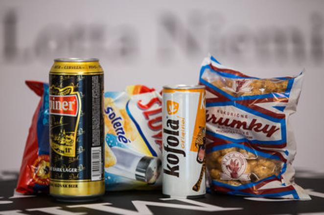
She was shown several Slovak brands by the Sme daily, and asked to comment on their quality. Her statements were as follows:
On the (soft Cola-like drink) Kofola:
"Isn’t it scary? Is it a puma or a tiger? (pointing to the glowing-eyed animal on the can) I would have thought it is either a beer or an energy drink because it is that size. But it says Kofola which is Cola-like, I may have guessed. However, I do not know enough about rituals here; I am based on a very western – American or western-European – view.”
A can of Urpiner beer:
"Is it a beer? This looks great. Exceptional Slovak beer. As it is a beer, ornaments, ornamental type, and swirls, varnishes, and all would be expected. It looks maybe similar to Budweiser, but perfectly OK.“
A package of salty Slovakia potato chips:
“Why is the brand name Slovakia? Very patriotic. Otherwise, it’s OK. I would maybe have liked to see a nicer salt-shaker and a better photograph but these trappings are seen on a lot of salty snacks.
Mind you, Budweiser did change their name to American Beer – I felt a bit of an inner eye-roll induced by the experience – they didn’t need to do that. But their design is wonderful; I just think they didn’t need to change the name to “America”.”
A package of peanut puffs from Nitra:
“It looks very local; I wish the package would be paper and not plastic – as it has a very home-made look, except that it is in this plastic paper. If it was in non-plastic, brown paper, it would be perfect. Because it is home-spun, kind of goofy, very retro… It should be a matt paper on the outside – you can still put plastic inside so that it doesn’t seep through – and otherwise, everything should be exactly the way it is. If it was in light-brown, flack paper, it would be gorgeous.”


 Urpiner beer, Slovakia potato chips, Kofola soft drink and Chrumky peanut puffs.... Slovak brands with Slovak design. (source: Sme - Jozef Jakubčo)
 US designer Debbie Millman (source: Sme - Jozef Jakubčo)